Unlike many reality shows, we can generally go into a season of Project Runway with some clue about what each contestant might bring to the table.
The Bravo bios are usually fairly detailed, with industry experience and educational background. Individuals who are already working on their own lines will often have images of their work online that the curious can view and evaluate.
Normally, we would only be using those details, our own expertise/personal taste/shameless bias, and an arcane Power Ranking ritual known only to the BuddyTV elite to come up with our pre-show Project Runway Power Ranking.
This season, however, the designers all also participated in a runway show, all featuring three of their own designs. The show was attended by Daniel Vosovic from Season 2, and so now we can add their actual designs, as well as Daniel’s first-hand observations on craftsmanship, etc., to our Power Ranking, making them even more…Power-ful. Can you handle it?
Here are our thoughts on the bottom five based on all of those elements.
15. Simone Le Blanc. Something about her outfit and half-gloves in her Project Runway photos have always bugged me. The proportion of her own outfit makes her look like a rectangle, and if a designer’s outfit doesn’t flatter herself, it gives me pause about wanting to put her clothes on my body.
Her runway look didn’t increase my confidence. The design and fabric she uses are not appealing, and Daniel’s remarks took her to task for the frayed edges. And you don’t even need that first-hand account to see the issue: the sewing problems actually are visible in the full size of the photo on the web! That’s not good.
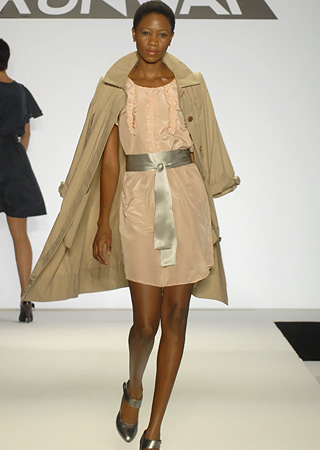
14. Sweet P. When I was writing the Meet the Designer article for Sweet P, there seemed to be something rather muted about the information available about her on the web. It’s hard to put my finger on, exactly, but the half-hearted linking of her name to Project Runway got me suspecting she might not be lasting long on Project Runway.
Her outfits offered in the show didn’t contradict my feeling. While Daniel points out she’s a lovely person, he also delicately states that they have “a nice home-done feel” (ouch) and wanting to see more “designer touches” to a simple shift dress.

Her runway looks were also all extremely similar: knee-length, flowy fabric, satiny sash. She added a trench in one look; a trench is not enough of an innovation to make up for the sameness of the others. I also question her color palette; her look book online has a jarring mix of saturated rich colors and pastels that – for being part of the same collection – don’t seem to have anything to do with one another. There’s a time and a place for interesting juxtapositions, but hers does not seem successful
12. Elisa Jimenez. Her story seems interesting, an intersection of fine arts and fashion. But her description of the first outfit she designed that got her attention gave me pause. She referenced that it had a golden spool sewed to the front, and eucalyptus leaves crusted with ginger. A red flag went off in my head that her interest in fine arts might have engendered in her that particularly intellectual (and, to my mind, dullsville) obsession with symbolism that trumps the actual form of the thing containing the symbolism.
Daniel expressed confusion over her dresses; they appeared stained, and he later heard it was possibly bee pollen? Were her designs beautiful and compelling, I’d love to see the jarring element of a kind of weird stain. However, her actual silhouettes and construction seemed too basic to merit that kind of risk-taking.
11. Steven Rosengard. Tim’s comments about Steven focused mainly on his humor. That’s nice, but what kind of designer is he? Daniel points out the dress to the right looks like Carolina Herrera and Oscar de la Renta show, and the comparison is apt. Were the dress beautiful and flattering, it might survive the comparison, but it’s not, so instead it just underwhelms. Daniel mentions fit issues with another look that was also underwhelming.
Unfortunately, there is no full-length picture of his third look to the left and it’s hard to get a sense from this photo. That one seemed like it might be interesting. Daniel said it was “Modern, chic, and certainly not for everyone. Though certainly – a unique architectural look.”
Tomorrow, we’ll have rankings for the next five designers.
– Leslie Seaton, BuddyTV Staff Columnist
Source: Bravo
(Image courtesy of Bravo)
Staff Columnist, BuddyTV
